Colour is one of the most exciting tools an artist has. Before you pick up a brush , it helps to understand how colours relate to one another. Artists arrange colours in a circle called the colour wheel , which acts like a map showing which colours are neighbours , which are opposites , and which will blend to make brand-new colours .
✨ The three primary colours are red, yellow , and blue . You cannot mix any other colours to make them — but you can use them to make almost every other colour in the world !
📷 Hawker Aircraft Ltd · CC0When you mix two primary colours together in roughly equal amounts , you get a secondary colour . Red and yellow make orange , yellow and blue make green , and blue and red make purple . These three secondary colours sit between the primaries on the colour wheel , forming the six basic positions on the circle .
🔗 Match each colour mix to the colour it makes.
Purple Green Orange
Purple Green Orange
Purple Green Orange
Beyond primary and secondary colours , there are tertiary colours — made by mixing a primary with a neighbouring secondary . For example , mixing red with orange makes red-orange , and mixing blue with green makes blue-green (also called teal ). This gives you twelve positions around the wheel , and artists use all of them.
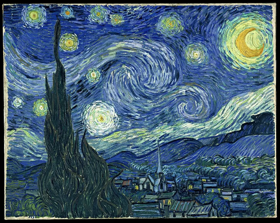
💡 Colours opposite each other on the wheel — like blue and orange , or red and green — are called complementary colours . Placed side by side , they make each other look brighter and really pop! Van Gogh loved using complementary pairs in his paintings for that electric feeling .
📷 Vincent van Gogh · Public domain🗂️ Sort each colour into the correct group: primary, secondary, or tertiary.
Primary Secondary Tertiary
Primary Secondary Tertiary
Primary Secondary Tertiary
Primary Secondary Tertiary
Primary Secondary Tertiary
Primary Secondary Tertiary
Primary Secondary Tertiary
Primary Secondary Tertiary
Artists also talk about warm and cool colours . Warm colours — reds , oranges , and yellows — remind us of fire and sunshine and seem to jump forward in a painting . Cool colours — blues , greens , and purples — feel calm and distant , like an ocean or a shady forest . You can use this trick to push things forward or push them back without even touching the size of the shapes you've drawn .
✨ The colour wheel was first published by Sir Isaac Newton in 1704. He arranged the colours of the rainbow into a circle and noticed that mixing the colours at the ends — red and violet — completed the loop perfectly .
✍️ Fill in the colour words to complete these sentences.
The three primary colours are red, _____ , and blue . Mixing yellow and blue makes _____ . Colours opposite each other on the wheel are called _____ colours .
yellow green complementary tertiary warm orange
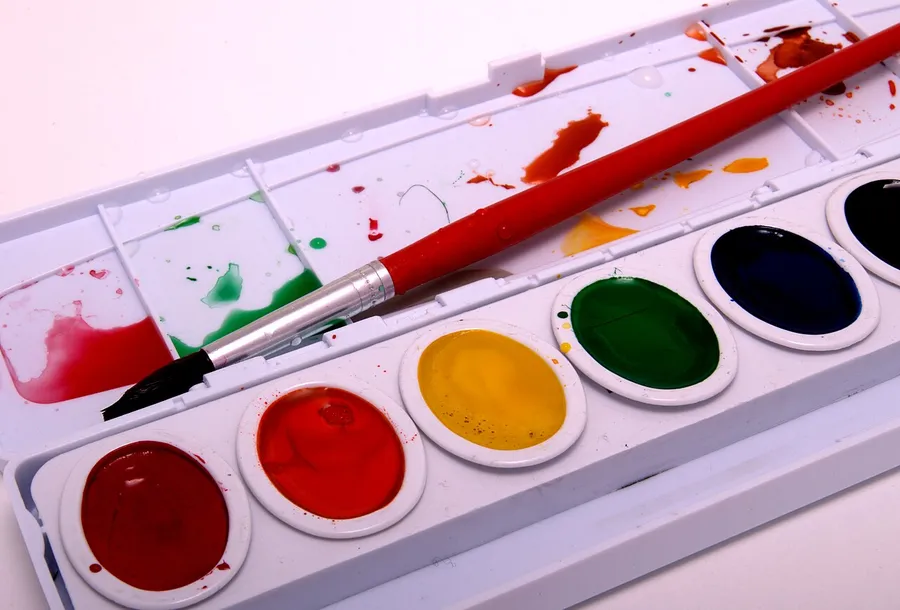
One last concept that colour artists love is tints and shades . Adding white to a colour makes a tint — for example , red becomes pink . Adding black makes a shade — red becomes a deep maroon . These variations help you add mood , depth , and realism to your artwork without needing any extra colours at all.
📷 Ariel Waldman from Muncie · CC BY-SA 2.0🃏 Flip the cards to test your colour knowledge.
? What are the three primary colours? Red, yellow, and blue. They cannot be made by mixing other colours together.
? What is a secondary colour? A colour made by mixing two primary colours: orange, green, or purple.
? What does adding white to a colour create? A tint — for example, red + white = pink.
? What are complementary colours? Colours opposite each other on the colour wheel, like blue and orange. They make each other look brighter when placed side by side.
? Are reds and oranges warm or cool colours? Warm colours! They remind us of fire and sunlight and seem to come forward in a picture.
Tap each card to see the answer.
💡 Next time you look at a favourite painting , see if you can spot warm and cool colours . Does the artist use complementary pairs ? Knowing this turns you from a viewer into a detective — and then into a creator !